
Throughout my career in market research, we have used PowerPoint decks to present findings and communicate information to marketing teams, R&D, and organizations overall.
Over the past few years, market research platforms have delivered faster reporting capabilities due to automation, natural language processing, text analytics, and AI (Artificial Intelligence). These results are usually displayed within dashboards, which have grown tremendously in popularity. Sometimes these results can be downloaded in the form of Excel reports, sometimes as PDFs, and sometimes you can export charts into PowerPoint.
Pros and cons of dashboards
Overall, dashboards are about rapid decision-making, collaboration, and early learning and exploration.
Many people use dashboards for recurring projects like tracking studies. If you are reporting results every month, you don’t need a PowerPoint deck; you can just go to the dashboard and update it at a moment’s notice and review your metrics. This helps speed up decision-making, and allows you to come back to it whenever you want – which is amazing!
I see the dashboard as something that has the potential to be very agile and iterative. The most common use is for a market researcher to meet with a client and show them results in real time, with the ability to drill down further with them. Dashboards are also great for quick follow-up questions: You can go into a dashboard and find answers on the fly.
But a lot of market research is ad hoc. It’s not a tracking study; it’s conducted for a specific objective, so there’s still the need to collect the data, download the data, analyze it in Excel, build a PowerPoint, and present the PowerPoint. All these steps can take at least a week.
A limited number of solutions create dashboards using templates designed for ad hoc research studies. In this case, a report is already built, and is, in essence, a dashboard. As results come in, the report is populated and the user can see results in real time.

This is helpful, but it means the questions you ask have to fit that report. There’s very little flexibility in what questions you ask and how you ask them. The upside is that you can see changes in real time, you can have reporting specific to the type of study you are doing, and you have interactivity that you would not have with PowerPoint slides. For example, with an automated research report, you can filter results by men, or by women, or you can click on a word in the word cloud to see the comments related to that word.
Pros and cons of PowerPoint
I see PowerPoint as an opportunity for a marketer, director, or VP to take the most important information from the dashboard and present it. If at the end of a research study a market researcher wants to have a definitive recommendation or a set of “so what now what,” PowerPoint is a better way to pull together, document and present that information.
With PowerPoint, you can also combine information from different sources into one deck, add graphics, and customize the look of what you are presenting.

Yet with PowerPoint, once your deck is complete, you are stuck with what you have. In most cases, you have spent a good deal of time and effort anticipating and pulling together what you think you need to present. If a question is asked and you don’t have it covered in your deck, you are not able to access additional information in the moment. This doesn’t fit well with the new agile way of working. For agility, dashboards work much better.
Best of both worlds
People want flexibility in the questions they ask. They also want a dashboard that can help them along the way. The Digsite team has spent the last nine months working to address this dual need by developing an interactive dashboard that lets you see all the responses to your qualitative study in a condensed, report format. Digsite’s SmartDashboard allows moderators and contributors rapid access to the results of your research. The dashboard can be refreshed in real time at any point during your data collection and provides you with the ability to filter results, customize the views, access natural language processing and text analytics, drill into keywords and sentiment analysis, and download results into PowerPoint. Digsite’s state-of-the art technology allows researchers to add titles, reorder charts, and edit word clouds to build their own custom PowerPoint report – making it easier than ever before to share market research findings and make rapid decisions.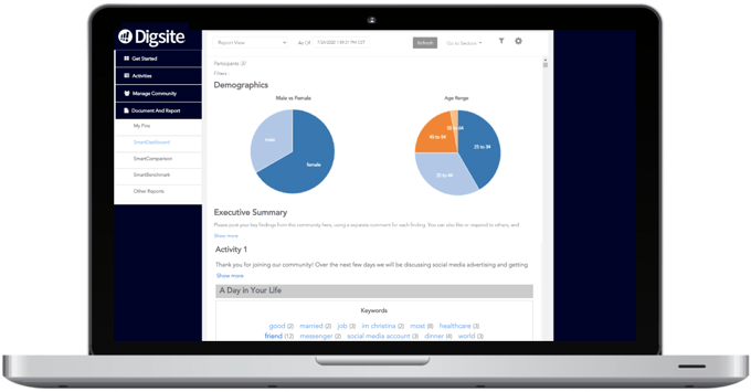
Dashboards and PowerPoint play different roles, so if you can integrate them you’re going to be more successful as a market researcher than trying to make your dashboard do everything for you or feeling like you have to build a PowerPoint deck for everything because your dashboard isn’t customizable enough.
If a dashboard alone doesn’t meet your needs, or if PowerPoint is too cumbersome and time-consuming for your presentations, Digsite’s SmartDashboard with editable PowerPoint may be a good solution for you.
Want to see Digsite's SmartDashboard and PowerPoint reporting? Schedule a discovery call with one of our research experts to see these new features in action.